Art process
 I’d thought I share some of the process I go through when creating Comic Critics.
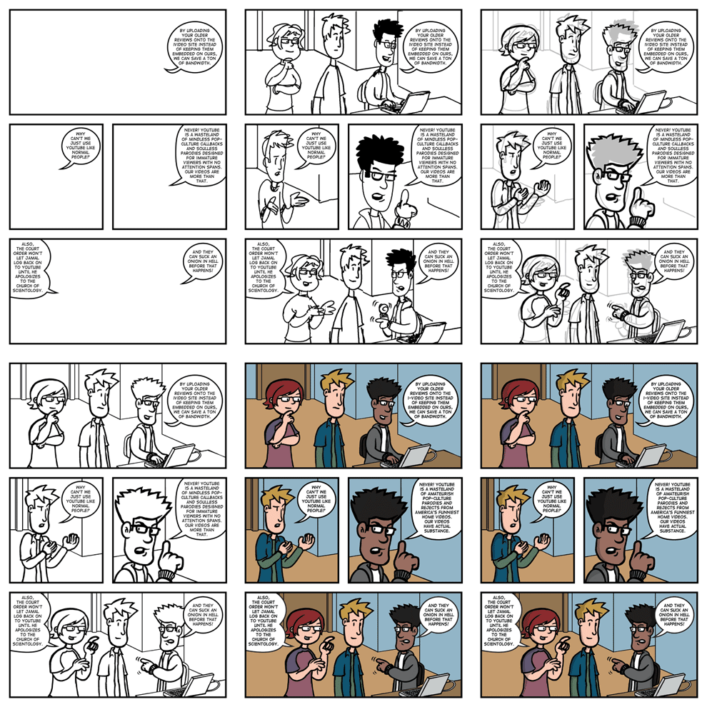
When I receive a script from Sean, I first do a quick breakdowns in a sketchbook. I then switch to working on my computer.
I first use Illustrator to layout the panels, letters and word balloons. From there, I import the panels and letters to Photoshop and, using a Wacom tablet, sketch the characters and backgrounds. I then send that to Sean to see what he thinks.
After getting feedback from Sean, I move to the “inking” stage. I switch my sketch to gray and draw on a separate layer. I draw the characters and some more important foreground elements. Next I draw in the backgrounds and get rid of the sketch layer. I then send this to Sean for another round of feedback.
After getting notes from Sean, I fix things and move to the coloring stage. I switch the B&W to a layer that multiples. On a layer underneath the B&W art, I add add the colors. I use a limited color pallet of various mixes of 25% increments of Cyan, Magenta, Yellow and Black. This give me a good range of colors, but also helps me not go overboard with the color. After finishing the coloring, I then add a layer thats is in-between the B&W and the colors. This is where I add shading, effects and any other extras that are needed.
This goes to Sean for one last look-over and then goes into the queue to get posted.

September 3rd, 2008 at 11:12 am
Like the overview, but there seems to be a slight loss of emotion between the sketch and the inking. Marissa and Josh seem much more expressive in the sketch, especially Josh’s pose in panel 2, and Marissa’s eyebrows (in sketch panel 1 she seems bemused, and in sketch panel 4 she actually looks snarky). If you could keep that level of expression after inking, it’d help out the humor.
Really want to point out that this week’s strip (9/3) was hilarious, and the art in panels 2, 4 and 5 showed a nice growth from week one to now. Keep it up!
September 3rd, 2008 at 11:43 am
One of the reasons the art has gotten better is I got a new Wacom pen around the tenth strip. My old pen’s sensitivity was going out and caused me to have to re-draw a lot of lines.
I do sometimes lose some “expressiveness” when I ink. I’ve been trying to loosen up when I ink, but I want to find a balance between a polished look and expressiveness.
September 3rd, 2008 at 1:03 pm
Pulling up/back Marissa’s hair so you could see both her eyebrows this week was a subtle, but very welcome, as was moving her forelock so that it didn’t give the illusion that it was the outline of the back of her skull, as it sometimes does.
Do you do these at “print” size, or scale them down? Maybe with a bigger canvas it’d be easier to ink. Look at the sketch from 3/21, if we could see details like Josh’s Little Orphan Annie-like eyes, it would just add to the polish.
September 3rd, 2008 at 1:35 pm
I work at 600 DPI in a 6 x 9 inch file. I can zoom in a lot to get really detailed if I want. I tend to ink the basic shapes quickly and then zoom in and add touches of detail. After finishing things, I then scale the art down to 72 DPI and 500 pixels wide.
Yeah I’ve been altering the look of the characters slightly over the course of time in order to get the most expression out of them while still trying to keep the basic look I started out with.
September 3rd, 2008 at 1:43 pm
Well, keep up the good work! I hope you weren’t too offended by my posts last week on CBR. The last one especially was meant to be helpful rather than snarky. So I apologise if the others seemed to mean spirited.
September 3rd, 2008 at 1:48 pm
I don’t mind any of the comments. While constructive posts are more helpful, I’m all for people expressing their opinions.
November 2nd, 2008 at 5:17 pm
Thanks for the concise overview – I’m a noob and getting a handle on how the technology is used is very helpful 🙂 (not a total tech noob though – I build websites, but my digital illustration abilities are limited)