Art test
Wednesday, July 16th, 2008Recently, I’ve been working on the style of the comic. Since this is a my first real color webcomic, I’ve been trying to find a style that works for me.
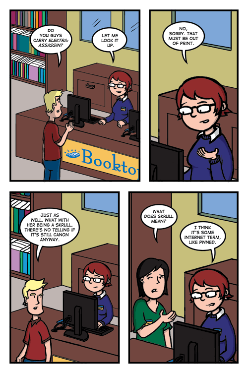
So far, I’ve been using a similar style that I used for my B&W comics. I use thick lines and light shading for the characters and thinner lines for the backgrounds. This style makes the characters somewhat standout from the background.
But since this is a color comic, I have more choices as to how I want to handle things. With B&W, I only have black , white and some shades of gray. But with color, I have many more options although I do use a somewhat limited color pallet to make things a little more controlled.
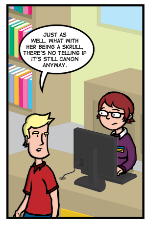
I recently experimented with a background style of border less backgrounds in such the backgrounds are made up of only color shapes with no black outlines. The style is similar to ones that some 2D characters use. Below is a test of one of the panels from this week’s comic.

I kind of like it. The characters seem to pop more and it gives the background a little more character to them. Sean liked it but was a little hesitant on changing things. We would like to know what the public thinks. Would you like to see us try this style in the actual comic? Or do you think the current style is more to your liking?

