Art test
Recently, I’ve been working on the style of the comic. Since this is a my first real color webcomic, I’ve been trying to find a style that works for me.
So far, I’ve been using a similar style that I used for my B&W comics. I use thick lines and light shading for the characters and thinner lines for the backgrounds. This style makes the characters somewhat standout from the background.
But since this is a color comic, I have more choices as to how I want to handle things. With B&W, I only have black , white and some shades of gray. But with color, I have many more options although I do use a somewhat limited color pallet to make things a little more controlled.
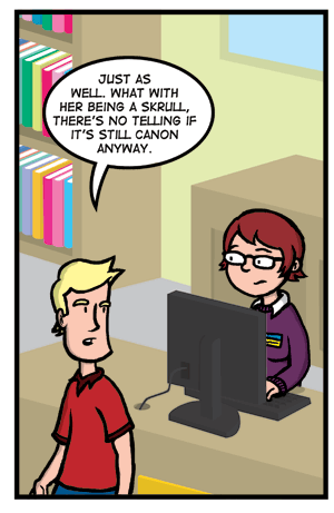
I recently experimented with a background style of border less backgrounds in such the backgrounds are made up of only color shapes with no black outlines. The style is similar to ones that some 2D characters use. Below is a test of one of the panels from this week’s comic.

I kind of like it. The characters seem to pop more and it gives the background a little more character to them. Sean liked it but was a little hesitant on changing things. We would like to know what the public thinks. Would you like to see us try this style in the actual comic? Or do you think the current style is more to your liking?

July 16th, 2008 at 2:22 pm
I don’t like it. It makes the characters seem like they’re in a different world than the background is. It also looks a little Colorform-y.
July 16th, 2008 at 3:13 pm
It kind of reminds me of the way some 2D sprites stand out from the backgrounds in old computer games.
I prefer it how it is at the moment though truth be told.
July 19th, 2008 at 6:33 am
I like it. It makes the characters pop like in animation. As a fellow artist, I can understand your need to experiment with style. The problem people might be having with it is you’re only showing the one panel. Try a whole strip once and show them side by side. If the overwhelming response is still to keep the outlines, at least keep these colors, because the brown in the published background seemed to make things a little dark.
July 30th, 2008 at 11:59 pm
I like it a lot, but I’d suggest strictly doing backgrounds like this. The computer in this panel isn’t really background sice it’s in front of one the characters, that makes it look a bit weird. Maybe you could give props used by characters or in the foreground the same lines or thin ones but do stuff further behind (like the window and the books) in this new style. I think it would seem more natural and bring depth to the image. Just my 2 cents, keep up the good work!
August 13th, 2008 at 2:15 pm
[…] – bookmarked by 1 members originally found by rocketbox66 on 2008-07-20 Art test http://comiccritics.com/2008/07/16/art-test/ – bookmarked by 3 members originally found by […]