Comic Pet Peeves – The I’s have it
Thursday, October 29th, 2009This installment of Comic Pet Peeves is about the lettering of I’s.
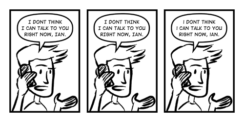
You may have noticed that when all caps is used for comic lettering that there is a difference between the the I’s.
This is because there is a capital CAP I and a lower case CAP I.
The capital I is used when a normal mixed cased capital I would be used. Usually this I has a top and bottom bar while the lower case CAP I is usually just a straight line.
Most comic fonts have this feature built in. Although some don’t. I’m looking at you ComicSans which you should never use for comic lettering.
For some good comic fonts, some of which are free if you are an indie publisher, you can check out Blambot.
