
This installment of Comic Pet Peeves is about the lettering of I’s.
You may have noticed that when all caps is used for comic lettering that there is a difference between the the I’s.
This is because there is a capital CAP I and a lower case CAP I.
The capital I is used when a normal mixed cased capital I would be used. Usually this I has a top and bottom bar while the lower case CAP I is usually just a straight line.
Most comic fonts have this feature built in. Although some don’t. I’m looking at you ComicSans which you should never use for comic lettering.
For some good comic fonts, some of which are free if you are an indie publisher, you can check out Blambot.
Welcome to the first installment of Comic Pet Peeves which will hopefully be a regular feature. It will feature the little things in comics that irk either me or Sean. Nothing that makes us hate the book. Just the things that get bug us.
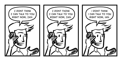
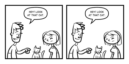
This week’s installment features something that usually makes me stew a little. It is when an artist draws someone talking without having their mouth open.
Here is an example of how a scene works with an open or closed mouth.

I think the open mouth conveys the what is going on and who is talking a lot better.
This tends to happen more when the artist draws in a more realistic style than cartoony, but I’ve seen it happen in all styles. While I know some artist think that they want show an expression that only a close mouth will work (gritted teeth to show anger), I think that is just the wrong way to think about it. I think there is almost always a open mouthed expression that will work just as well.